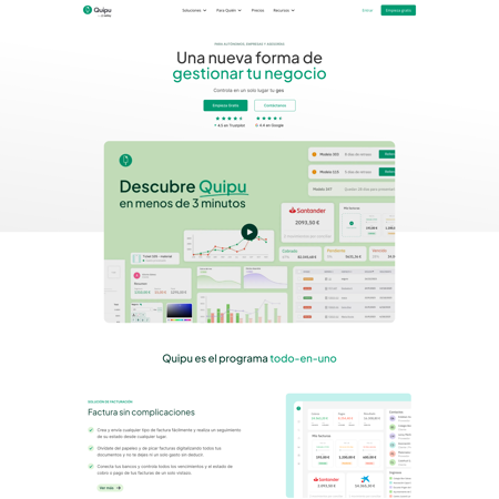
Discover checkmark.com design foundations
Learn how checkmark.com uses colors and fonts to enhance user experience and design coherence.
Last update: 07/03/2024
ICONS

TYPOGRAPHIES
Aa
ABCDEFGHIJKLMNOPQRSTUVWXYZ abcdefghijklmnopqrstuvwxyz 0123456789 !@#$%^&*()
Aa
ABCDEFGHIJKLMNOPQRSTUVWXYZ abcdefghijklmnopqrstuvwxyz 0123456789 !@#$%^&*()
Aa
ABCDEFGHIJKLMNOPQRSTUVWXYZ abcdefghijklmnopqrstuvwxyz 0123456789 !@#$%^&*()
Aa
ABCDEFGHIJKLMNOPQRSTUVWXYZ abcdefghijklmnopqrstuvwxyz 0123456789 !@#$%^&*()
Aa
ABCDEFGHIJKLMNOPQRSTUVWXYZ abcdefghijklmnopqrstuvwxyz 0123456789 !@#$%^&*()
Aa
ABCDEFGHIJKLMNOPQRSTUVWXYZ abcdefghijklmnopqrstuvwxyz 0123456789 !@#$%^&*()
Aa
ABCDEFGHIJKLMNOPQRSTUVWXYZ abcdefghijklmnopqrstuvwxyz 0123456789 !@#$%^&*()
Aa
ABCDEFGHIJKLMNOPQRSTUVWXYZ abcdefghijklmnopqrstuvwxyz 0123456789 !@#$%^&*()
Aa
ABCDEFGHIJKLMNOPQRSTUVWXYZ abcdefghijklmnopqrstuvwxyz 0123456789 !@#$%^&*()
Aa
ABCDEFGHIJKLMNOPQRSTUVWXYZ abcdefghijklmnopqrstuvwxyz 0123456789 !@#$%^&*()
COLORS
CALL TO ACTION
The call to action color is specifically chosen to stand out on the page. It's used on elements that require user interaction or urgent attention, such as "submit" buttons, promotional banners, or important links.
50
50
#adffd8
100
100
#7affbf
200
200
#47ffa6
300
300
#14ff8e
400
400
#00e074
500
500
#00ad5a
600
600
#007a3f
700
700
#004725
800
800
#00140b
900
900
#000000
950
950
#000000
HERO
The hero color is used to draw attention to the most important content on the page. It's the main color used on content above the fold.
50
50
#ffffff
100
100
#ffffff
200
200
#ffffff
300
300
#ffffff
400
400
#ffffff
500
500
#f3fbf7
600
600
#ccefdc
700
700
#a5e3c1
800
800
#7ed7a6
900
900
#57cb8c
950
950
#38b771
ACCENT
The accent color is used to highlight important elements on the page, such as headings, links, or buttons. It's a secondary color that complements the primary color scheme.
50
50
#99ff99
100
100
#66ff66
200
200
#33ff33
300
300
#00ff00
400
400
#00cc00
500
500
#009900
600
600
#006600
700
700
#003300
800
800
#000000
900
900
#000000
950
950
#000000
BACKGROUND
The background color is the primary color used in the background of the page. It's a neutral color that provides a backdrop for the content on the page.
50
50
#ffffff
100
100
#ffffff
200
200
#ffffff
300
300
#ffffff
400
400
#ffffff
500
500
#f3fbf7
600
600
#ccefdc
700
700
#a5e3c1
800
800
#7ed7a6
900
900
#57cb8c
950
950
#38b771
SURFACE
The surface color is used to create depth and dimension on the page. It's a light color that's used on elements like cards, modals, and other surfaces that need to stand out from the background.
50
50
#919191
100
100
#787878
200
200
#5e5e5e
300
300
#454545
400
400
#2b2b2b
500
500
#121212
600
600
#000000
700
700
#000000
800
800
#000000
900
900
#000000
950
950
#000000