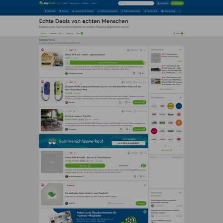
Discover rewe.de design foundations
Learn how rewe.de uses colors and fonts to enhance user experience and design coherence.
Last update: 07/12/2024
ICONS

TYPOGRAPHIES
Aa
ABCDEFGHIJKLMNOPQRSTUVWXYZ abcdefghijklmnopqrstuvwxyz 0123456789 !@#$%^&*()
Aa
ABCDEFGHIJKLMNOPQRSTUVWXYZ abcdefghijklmnopqrstuvwxyz 0123456789 !@#$%^&*()
Aa
ABCDEFGHIJKLMNOPQRSTUVWXYZ abcdefghijklmnopqrstuvwxyz 0123456789 !@#$%^&*()
Aa
ABCDEFGHIJKLMNOPQRSTUVWXYZ abcdefghijklmnopqrstuvwxyz 0123456789 !@#$%^&*()
Aa
ABCDEFGHIJKLMNOPQRSTUVWXYZ abcdefghijklmnopqrstuvwxyz 0123456789 !@#$%^&*()
Aa
ABCDEFGHIJKLMNOPQRSTUVWXYZ abcdefghijklmnopqrstuvwxyz 0123456789 !@#$%^&*()
Aa
ABCDEFGHIJKLMNOPQRSTUVWXYZ abcdefghijklmnopqrstuvwxyz 0123456789 !@#$%^&*()
Aa
ABCDEFGHIJKLMNOPQRSTUVWXYZ abcdefghijklmnopqrstuvwxyz 0123456789 !@#$%^&*()
Aa
ABCDEFGHIJKLMNOPQRSTUVWXYZ abcdefghijklmnopqrstuvwxyz 0123456789 !@#$%^&*()
COLORS
CALL TO ACTION
The call to action color is specifically chosen to stand out on the page. It's used on elements that require user interaction or urgent attention, such as "submit" buttons, promotional banners, or important links.
50
50
#fdd3d8
100
100
#fca1ac
200
200
#fa7080
300
300
#f83f55
400
400
#f60e29
500
500
#ca071e
600
600
#990617
700
700
#67040f
800
800
#360208
900
900
#050001
950
950
#000000
HERO
The hero color is used to draw attention to the most important content on the page. It's the main color used on content above the fold.
50
50
#ffffff
100
100
#ffffff
200
200
#ffffff
300
300
#ffffff
400
400
#ffffff
500
500
#ffffff
600
600
#e6e6e6
700
700
#cccccc
800
800
#b3b3b3
900
900
#999999
950
950
#808080
ACCENT
The accent color is used to highlight important elements on the page, such as headings, links, or buttons. It's a secondary color that complements the primary color scheme.
50
50
#ffffff
100
100
#ffffff
200
200
#ffffff
300
300
#ffffff
400
400
#ffffff
500
500
#e7f1f3
600
600
#c4dee3
700
700
#a2cad2
800
800
#80b7c2
900
900
#5da3b1
950
950
#478794
BACKGROUND
The background color is the primary color used in the background of the page. It's a neutral color that provides a backdrop for the content on the page.
50
50
#ffffff
100
100
#ffffff
200
200
#ffffff
300
300
#ffffff
400
400
#ffffff
500
500
#ffffff
600
600
#e6e6e6
700
700
#cccccc
800
800
#b3b3b3
900
900
#999999
950
950
#808080
SURFACE
The surface color is used to create depth and dimension on the page. It's a light color that's used on elements like cards, modals, and other surfaces that need to stand out from the background.
50
50
#ffffff
100
100
#fef8f1
200
200
#f9e2c2
300
300
#f5cb94
400
400
#f1b465
500
500
#ec9d36
600
600
#db8514
700
700
#ad6910
800
800
#7e4c0c
900
900
#4f3007
950
950
#211403